Pure CSS toggle switch
In this step-by-step tutorial, you'll learn how to create a toggle switch using only HTML and CSS. No JavaScript!
What is a toggle switch?
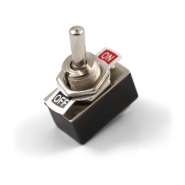
A toggle switch (known also as a «toggle» or just a «switch») is one of the common and classic an user interface control that has two mutually-exclusive states such as on and off. It came from real life: toggles are the digital equivalent of actual switches:
It may seem that toggles and checkboxes are the same, but they aren't. At first it seems, checkboxes as well as toggles also have two states: unselected and selected. Actually, checkboxes have three states: unselected, selected, and indeterminate while toggles are either off or on.
The second difference between toggles and checkboxes is a type of response: instant or not. Use a toggle switch when you need an instant response on an action that this toggle switch performs. If you don't need an immediate effect you should use a checkbox. The example of the toggle with the instant response you can check out on the demo above.
On the right is an example of what we'll build in this tutorial.
Let's go!
Step 1: Create a markup
Our future javascripless toggle has a quite simple HTML markup. To begin with, we need to add the skeleton. HTML element <label> is this skeleton. Then there are three nested elements each of whom has their own job.
A toggle input is the most important nested element. HTML element <input> is used to create interactive and complex control. Selected type checkbox means that this input allows single values to be selected or deselected. Do not be confused by checkbox type. Nest the toggle input directly inside <label> element to associate our wrapper with an <input>. In this case the for and id attributes are not needed because the association is implicit.
Next nested element is a toggle switch. The toggle swtich is required to customize the toggle. We'll deal with that in the next step and this element will not be visible until step 4.
At least, a toggle label represents a caption for the toggle in user interface.
Pay attention: there are no divs. HTML element <div> not allowed as child of element <label> because it's a block element and we cannot place a block element inside of an inline element. Why? Check out my article Semantic markup for the little ones. Using HTML inline element <span> for the toggle switch and the toggle label allows us to place it inside of the <label> element.
Putting it all together, here's what the required markup looks like:
1<label class="toggle">
2  <input class="toggle__checkbox" type="checkbox" />
3  <span class="toggle__switch"></span>
4  <span class="toggle__label">On</span>
5</label>You need take a note: HTML markup will remains the same until the end of this tutorial.
The toogle doesn't look very good so far, but verything in its own time. Let's start customizing with...
Step 2: Hide the input element
We're going to create custom toggle interface therefore we have to hide the input element because its appearance it's not needed.
CSS property visibility: hidden; allows to hide the toggle input without changing the layout. The input is invisible, but still affects the toggle as normal - try to click on the label in the demo below to see it.
1.toggle__checkbox {
2  position: absolute;
3  visibility: hidden;
4}The demo above looks lonely, but wait a minute and scroll to the next step.
Step 3: Make the toggle fancy ✨
Next up, let's start to customize the toggle.
At first, we should think about an user interface. CSS property cursor: pointer; will indicate to users that the whole toggle is a clickable element.
There are no more required styles for the toggle skeleton. CSS property display: inline-flex; with align-items: center; is optional here. CSS Flexbox property align-items centers the toggle content along the cross axis.
1.toggle {
2  display: inline-flex;
3  align-items: center;
4  cursor: pointer;
5}
At second, let's customize the toggle label.
1.toggle__label {
2  margin-left: 10px;
3}
You can do whatever you want with this element. All to your taste!
Also, take a note that you can feel free to experiment with the layout of the toggle label. For example, you can lift it up the HTML markup before the toggle switch to align the label on the left. It won't affect toggle behavior.
Please: don't ignore the toggle label! Label makes it clear what option the toggle controls, as well as what state the toggle right now. Also one of the best practise is writing clear labels. The toggle labels should describe what the control will do when the switch is on.
And thirdly, we're going to customize the toggle switch itself. There are a lot of different toggle user interfaces. I've chosen one of the classic style with rounded edges and a sliding ball as you can see early.
Here are the related styles and some intermediate result:
1.toggle__switch {
2  position: relative;
3  display: inline-block;
4  width: 56px;
5  height: 32px;
6  border-radius: 32px;
7  background: #dddddd;
8  transition: background 0.25s;
9}As you can see, there are a few magic numbers . The magic numbers are 56 and 32. We needed to do something with them. Let's define two variables.
I've used to declare two SASS variables as I've used SASS here. You can use CSS variables or completely refuse using variables and write all values directly in CSS properties as written above.
The first variable is a size of the toggle switch ball that we'll implement in the next step. The second variable is a gap between edges of the toggle.
1$width: 24px;
2$gap: 4px;
Let me explain. The whole toggle consists of two equal parts and the toggle ball slips between them, therefore, the toggle switch is equal to $width * 2 + ($gap * 2), height is equal to $width + ($gap * 2) and border radius is equal to $width + ($gap * 2). Next we're going to create the toggle switch ball with radius is equal to $width and set indentation from egdes equal to $gap. To understand check out figures below.


Check out the example in the right. With a bit of modification, we get the following code.
It looks confusing and a bit incomprehensible now, but this changes make the toggle style more flexible. If you ever want to change the toggle size, you need only edit two variables. Also you don't have to calculate anything.
Try to avoid magic numbers wherever possible. Everything is made much clearer when we replace magic numbers with descriptive names since it makes a code easier to read and makes it more maintainable since we can update the value of the magic number by changing its variable assignment.
1.toggle__switch {
2  position: relative;
3  display: inline-block;
4  width: $width * 2 + ($gap * 2);
5  height: $width + ($gap * 2);
6  border-radius: $width + ($gap * 2);
7  background: #dddddd;
8  transition: background 0.25s;
9}
Move on. The result are still far from satisfactory, but it won't be long now, I promise.
Step 4: Create the toggle switch ball
To build the toggle switch ball, we'll define ::before pseudo-element. It will allow to avoid using additional HTML element in our markup.
The toggle switch ball style is a little tricky, isn't? Let's clear it up.
1.toggle__switch {
2  &:before {
3    position: absolute;
4    top: $gap;
5    left: $gap;
6    width: $width;
7    height: $width;
8    background: #ffffff;
9    border-radius: 50%;
10    transition: left 0.25s;
11  }
12}
The toggle switch ball style depends on the toggle switch size that we defined above. As mentioned above, the toggle consists of two equal parts that are tied together - on and off. The ball slips between them from the left to the right and vice versa. With a few simple calculations, you can find out that the ball size directly depends on the size of the toggle: the ball width is two times less than the toggle width and the ball height is equal to the toggle height. Also we need to add some indentation between the edge of the toggle and the ball. Here we used already familiar variables $width and $gap.
And that's all here!
Step 5: Add the toggle animation 💃
As you may have noticed, the toggle above does not switch. Let's revive out it! We'll specify some more custom styles. This is the most important part of styling.
1.toggle__checkbox {
2  position: absolute;
3  visibility: hidden;
4
5  &:checked ~ {
6    .toggle__switch {
7      background: #8a2be2;
8
9      &:before {
10        left: 50%;
11      }
12    }
13  }
14}What's going on here? CSS pseudo-class selector :checked represents HTML checkbox element that is checked or toggled to an on state.
As a result, then checkbox is checked, it will be changed CSS property background and changed the toggle switch ball position. The percentage positioning with left: 50%; is used here instead of using another magic number such as left: 28px;.
Here are the finished markup and styles:
1<label class="toggle">
2  <input class="toggle__checkbox" type="checkbox" />
3  <span class="toggle__switch"></span>
4  <span class="toggle__label">On</span>
5</label>
That it really is all about the toggle switch 🤪
1.toggle {
2  display: inline-flex;
3  align-items: center;
4  cursor: pointer;
5
6  &__checkbox {
7    position: absolute;
8    visibility: hidden;
9
10    &:checked ~ {
11      .toggle__switch {
12        background: #8a2be2;
13
14        &:before {
15          left: 50%;
16        }
17      }
18    }
19  }
20
21  &__label {
22    margin-left: 10px;
23  }
24
25  &__switch {
26    position: relative;
27    display: inline-block;
28    width: $width * 2 + ($gap * 2);
29    height: $width + ($gap * 2);
30    border-radius: $width + ($gap * 2);
31    background: #dddddd;
32    transition: background 0.25s;
33
34    &:before {
35      position: absolute;
36      top: $gap;
37      left: $gap;
38      width: $width;
39      height: $width;
40      background: #ffffff;
41      border-radius: 50%;
42      transition: left 0.25s;
43    }
44  }
45}